WISHTRAPPED
hello and welcome!hi! i'm Elias, and i also go by Siffrin online - i am a game artist and a student at HKU Games."the Universe leads. we can only follow."
please view this site on pc, this layout does not work on mobile!
clicking on most images will enlarge them :]

about me!
| illustration | software | languages (all fluent) |
|---|---|---|
| CLIP STUDIO PAINT | GameMaker | English |
| Paint Tool SAI 2 | RPGMaker | Dutch |
| Procreate | Unity | Russian |
i've been told that "the closer something is to "Weird Horror Thing" the more likely it is [i] will either know it or be interested in it", and, yeah!some examples of the above and inspirations of mine would be- ANATOMY by Kitty Horrorshow, and really anything about Haunted houses or architecture that "rejects humanity".- Mouthwashing by Wrong Organ. the medium of a video game and its shifting points of view beautifully working with the idea of seeing what you want to see.- Hello Charlotte by etherane. i've experienced the game multiple times, but still cannot make sense of the surreal last episode in the best way possible.i've realized i want to create games that don't feel like games, which admittedly is hard to describe.
but more importantly, to make games that don't feel like games, i've got to create games that do feel like games at first, to really look into what makes a game feel like one.group projects-wise, i've found i enjoy making the UI, sprites, icons and things that make everything look cohesive and stylized in a uniform way. as seen a lot in the character design section, i'm also a big fan of experimenting with various levels of detail :]
game / project-related things i made that aren't really a full page
for one of our projects our team worked together with a client and had to come up with and pitch a game concept that fit the criteria they gave us. we did not have to deliver a finished product, just a pitch we gave as if we were actually planning to make it real.our client ended up being Galaxy Grove, who wanted us to come up with a game that would fit in their "[X] to [Y]" series (eg. Station to Station).
we came up with Port to Port, a game where you manage a port town, trade goods and explore at sea.i made the UI for a "fake screenshot" of the player being in their own town:
i do like how it turned out on its own, although some parts look very mismatched and pasted on top. the mode buttons do fit in, as does the item bar, but the scrolls do look too cartoony in my opinion.
it's likely the flat colors contrasting with the fully rendered voxel art town - if i were to tackle this screenshot again, i would experiment with a more pixelated look, a painterly one, or a combination. or maybe try adding an outline to go with the cartoony look instead of against it.
more UI and assets! a main menu for a stageplay themed horror game. story-wise, the game focused on what the main character, the understudy for the main role who never gets to perform, was hiding in their locker backstage;
visuals-wise we wanted to highlight the horror aspect by adding 2D elements to an otherwise 3D environment, which worked with performance props!
the current performance as of the game's events was Macbeth, which we chose for its themes and recognizability. below are some stage props relevant to the events of the play that i designed:
art and other things i made that aren't game-related
starting off with a big interest of mine - Minecraft! i adore how people use the sandbox as a medium to tell stories, and BEDROCK.ZIP got me invested enough to come up with my own designs for the characters' Minecraft skins.
i had a lot of fun coming up with little details - making Zeemyth's hotbar a belt, giving Veil a helmet and making Euri's buns looks like bear ears because the mask somehow reminded me of a bear.
fun fact, apparently Aqer's skin is that of an existing character. i did not know this when working on my design and i'm really happy with how different the faces unintentionally ended up being!
i love imagining these pixels in detail so much. i love these pixels.

concept sketch of a character based off the missing texture. i decided to experiment with a limited color palette, using different sizes of squares and dithering to break up the design.
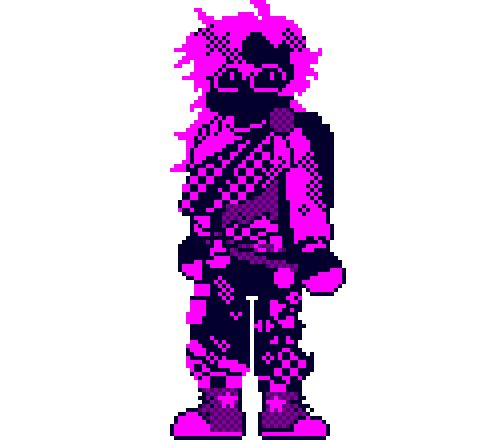
scaled down pixel art version of the design from a project i ended up using this character in. it was a challenge to fit in everything while keeping it recognizable, but i learned a lot!
persona's!
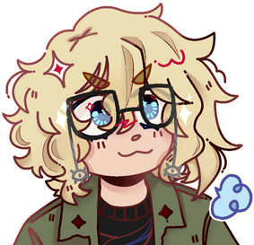
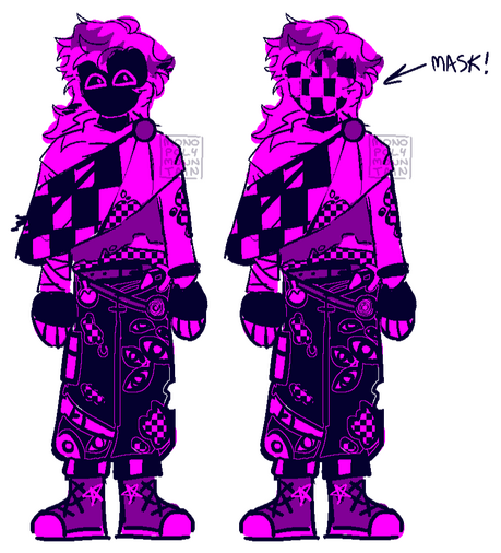
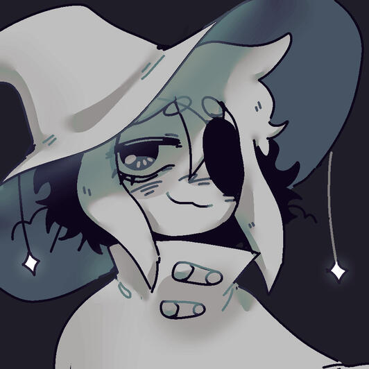
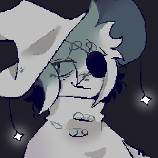
my current persona! you can also see them on the first page of this website.its design is heavily based on my actual appearance and my favorite items of clothing i own in real life.i landed on pretty much literally myself after a previous attempt at a self-insert, mascot, whatever, didn't connect with me the way i felt a persona should.
for my previous "mascot" i focused more on the colors and the vibe - i did like how the design turned out.it was full of loose elements i liked, and its minimal color palette allowed be to experiment with colors around it in different ways,but it didn't feel like a representation of me.
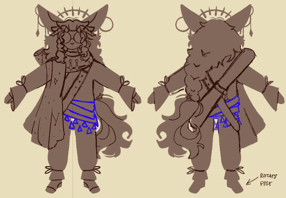
an assignment for our character design subject was to make a character that would visually fit into the Legend of Zelda universe.
we had to walk through the entire process - design analysis, concepts, the 2D design and having to make it into a 3D model.
concept / 2D

an assistant's vision after
i explained the character idea i had.
"final" with the incorporated feedback,
but still sticking to my own vision.
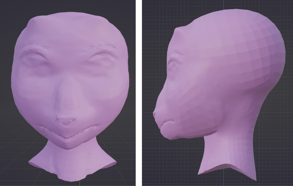
3Di am not at all a 3D artist and this was a struggle, but i got through it! i did it!
made with shapes from a provided blockout file, there were some parts like the hair and face that were later smoothed out in sculpt mode.

sculpting the head was my first experience with the sculpt mode.
i included smaller details like the horn nubs
and flatter snout after referencing the official LoZ models.
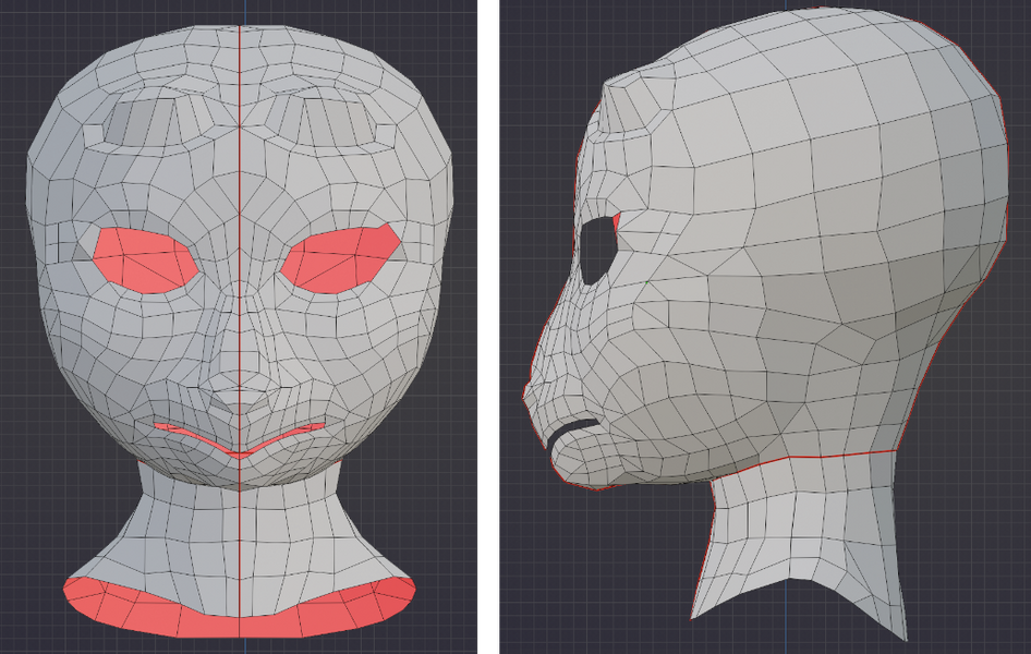
retopology, also for the first time.
we did not have to rig the face, but i left a gap
for the mouth for practice.
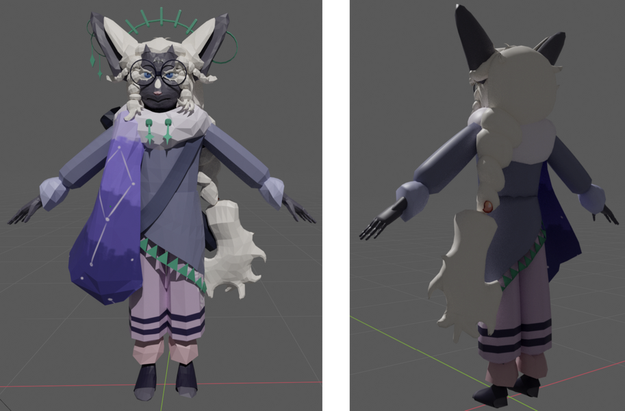
final! i left most things flatcolored except for the Secret Stone, as it was connected to the character's species/lore.
in the past i had been commissioned to make two icon sets for a Discord server - one of items that would be used within a story, and another of role icons of different tiers.i got sent specific references for the items that i was asked to stylize (hence the difference in amount of detail) and was given the theme of snowflakes that get progressively more detailed as the tiers progress.
another commission - a logo for a friend's game. they wanted a more recognizable logo that could be used on promotional material or as a sticker. the criteria i was given was to have the idol as a centerpoint and to incorporate the infinity symbol in its design, with freedom for the lettering and any other elements.
the "are" in the teeth ended up completely invisible, but i do still like the asymmetrical, imperfect charm it gives the design.
other logo's / watermarks of mine (platform-specific and old usernames)
merchandise!
i make acrylic charms (and more) out of designs i draw! my small Etsy shop has been running since november 2023.while the designs are all fanart of existing pieces of media, this does mean i have experience working with a manufacturer, setting up sale listings, managing preorders/costs and everything else that comes with owning an online store.
a somewhat silly three-page comic i made about my experience of having ADHD. 👍people thought it visually got the point across very well, despite me being the first person they'd met who described their experience as "a wheel of fortune focus being spun in my brain every day".
and someone even said they'd like it as a comic or a print which was an unexpected surpise :〇
style experiment(s)!
this section will hopefully be expanded - this approach to these studies is very fun & i want to experiment with more combinations as well as applying in addition to replicating.

@starlooping on Tumblr

@systelon on Tumblr

my attempt!
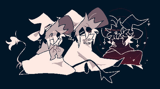
for my first attempt, i took the lineart style from systelon, the harsh pixel edges and sharper shapes, and combined it with starlooping's coloring/shading. i really enjoy their both harsh and blurry shadow edges and was curious about what effect they would have if the lines were sharp as well.
other art!
inspirations:
- The Magnus Archives:
The Spiral
MAG183 - Monument- House of Leaves- BEDROCK.ZIP I + II-MyHouse.wad
currently not uploaded on itch.io or anywhere else. link will be added when it is available!
"What Lies Beyond?" was an incredibly self-indulgent project!! :]i chose something fairly specific and niche, but close to me for the theme: The Spiral from the podcast The Magnus Archives, a "name" given to the fear of not being able to trust your own mind, of reality as you know it being wrong.the highlight of its presentation for me was one of the evaluators thinking there was some kind of pattern to the doors in a certain area that would lead you the right way.
afterwards, i was absolutely delighted to tell them that there was no pattern at all, and the path was being randomly generated.i would definitely say this was a success - the above scenario was the exact experience i wanted this project to be in its entirety.
process:
my "proper goal" for the game was to create a sense of repetition, a recognizable pattern, and then to break it. one of the ways in which i did that was keeping the colors of the three main areas tied together.it was a deliberate choice to use GameMaker for this project, as I was interested in trying something new and we had only been taught Unity until that point. this also led to me more confidently trying out coding solely by myself, as i chose to use written code instead of visual scripting but still understood what i was typing as opposed to copy-pasting Unity code that i hoped did what i thought it would.
i could not decide on a direction to go in with this project for a long time,
until BEDROCK.ZIP II released right after our study trip to Berlin.BEDROCK.ZIP is essentially Mark Z. Danielewski's House of Leaves translated into the format of a Minecraft ARG, a combination of two things i love a LOT.part II provided a new character's perspective on the events from part I, which made me want to create something based on how i experienced and interpreted both parts in turn...so i did!
as the main source of inspiration was made in Minecraft, it was only fitting to use pixel art, which also limited the amount of detail i could put into certain assets, but added cool effects like the usage of dithering instead of "smooth" gradients.a lot of the process and thinking the idea through happened in my sketchbook - such as some of the art, to later transfer it and preserve that "scratchy" look in the pixels.it took me a while to figure out the "layout" and logic of the area.
i considered putting some kind of cryptic message at the end, but decided against it as the game was too short to provide any real lore or context.
after all, i wanted the experience to be confusing like a mismatch of puzzle pieces, not a message you can't decipher and give up on making sense of.
click on the thumbnails to go to the itch.io page!
i gave myself a challenge to complete three prompt-based gamejams over the course of several weeks - one three hour long gamejam to get the idea down and around a week to polish the project. it was surprisingly fun - i ended up not overthinking everything having to be perfect and built up some confidence in quickly setting up a prototype for a concept.
don't look at it:
for the first prompt, i incorporated the mechanic of the game checking the position of the mouse, making sure the player was focused on the in-game screen. if they move the mouse outside of the bounds of the screen to inspect one of the distractions going on in the background, they take damage.this game taught me to spawn in objects with a random position within a certain range, and more notably how to make sure that the player doesn't take infinite damage if they stay outside the designated area.
the more you have, the worse it is:
it is fairly intuitive to grab a coin in a video game when you see it - why not make it a bad thing? now, whenever you pick up a coin, it appears "collected" somewhere else on the screen. this not only leads to confusion between real and "fake" collected coins, but also obstructed vision in general.this one was my favorite to work on, but came with its own struggles, such as making sure the coins did not go off-screen when the level scrolled past. it was a fun experience making a simple platformer and trying to limit myself within the art style aspect to still include a challenge.
monsters!:
taking place in someone's back yard, the goal of monsters! is to scare away the shadow critters that pretend to be regular animals - but you have to be fast enough! essentially whack-a-mole, but over time, the appearance of a monster changes into that of a peaceful animal.here i experimented with spawn objects which would randomly appear with a different sprite. i was already familiar with random seeds, but this was different and complicated in its own way, such as getting the sprites to mirror correctly, and i made it work! i also got to apply my "no infinite damage" knowledge from the first week of this challenge.
inspirations:
- Slay the Princess- Keep Talking and Nobody Explodes- The Stanley Parable- Stories Untold- "classic" horror RPGMaker games (Ao Oni, Witch's house, Ib, Mad Father, etc.)
concept - not on itch.io
i pitched this idea for a subject that was all about presenting and explaining a concept. we were not limited by what would or would not be possible within an engine, and simply had to present it confidently and clearly.
i asked myself the question - how could i make the player still feel like they are the player, yet still have them be their own element of the story?my answer was an "escape room" RPGMaker style game taking place in a haunted house, but with a twist that the main character and the player are two distinct entities. they have to work together to make it out - the character sees the world from more angles than the player by virtue of physically existing in that space, but the player has access to things like the UI.
not on itch.io (yet), but there is a
our team made Tineatus Exodus for project hybrid, where we had to combine digital and physical aspects. the final product was a VR game, during which our team would move the player's chair, touch them, and otherwise physically interact with them to heighten the immersion. i, as a 2D artist, focused on concept art and whatever 2D assets we decided to include in the 3D environment, as well as physical assets.
each horseman was also assigned a domain. conquest’s domain had the ferryman row through a church, empty and silent, but with the centerpiece still intact; the aftermath of what earned the horseman of conquest its crown, given form in a window of stained glass.
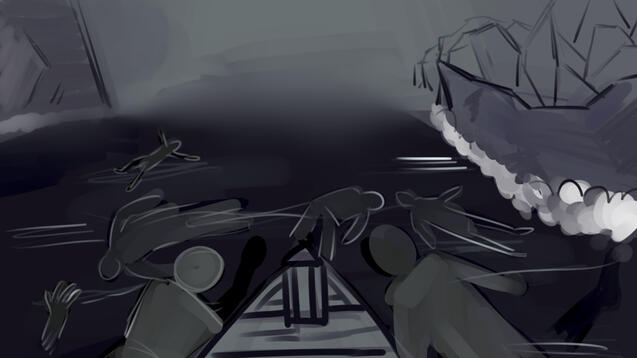
instead of crashing through it and shattering the glass, the boat simply passes through it, everything having been only an illusion.i had also made some concept art for war's domain - it was meant to be a wide, open space, contrasting with the other domains, but dreadful in its own, inescapable way. we took inspiration from concepts like the ocean surrounding the maw from Little Nightmares and SCP-2316, "you do not recognize the bodies in the water".
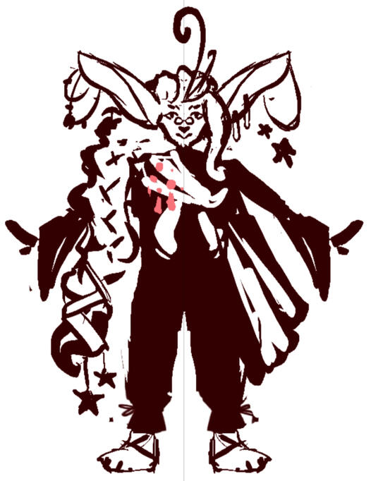
the idea of Tineatus was a journey through the afterlife, where the player played the role of the ferryman with the passengers being representations of the four horsemen.each artist from the team designed one of them, with me taking on conquest. for its design, i directly referenced the biblical passage:
[...] "Come!" I looked, and behold, a white horse, and he who sat on it had a bow; and a crown was given to him, and he went out conquering and to conquer.
— Revelation 6:1–2 New American Standard Bible
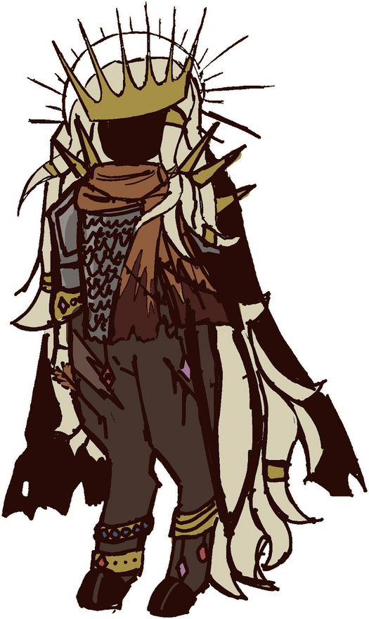
we agreed to keep the horsemen humanoid, but not human - so i chose to give conquest hooves and to have its crown physically be a part of it, as well as keeping it faceless - when one is in a position of power, it influences and often overshadows who they are (or in this case were) as a person.
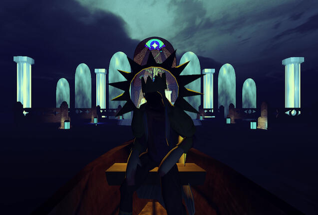
initially, one of the concept designs included conquest itself, but was later scrapped in favor of the tree, as the horseman would neither have claimed its title nor have looked like it did in the game at the moment of the event pictured. with the domain, it also felt like it focused too much on the horseman visually rather than thematically, with it sitting right in front of the player as well.
for the physical aspect and the immersion, our team acted out inviting the player into our experience - they are the new ferryman, this is their new job, and with a job comes a contract.for this, i had designed and printed a contract that the players would have to sign, singing the paper to really sell that older look and adding a stamp to make it more official.the contract consisted of two parts - one detailing what the player could expect from the experience such as loud noises, flashing lights and motion sickness.the other spoke to the ferryman, detailing the rules of the job, such as not being allowed to speak to the passengers.
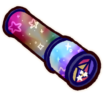
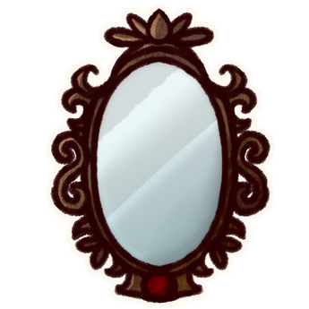
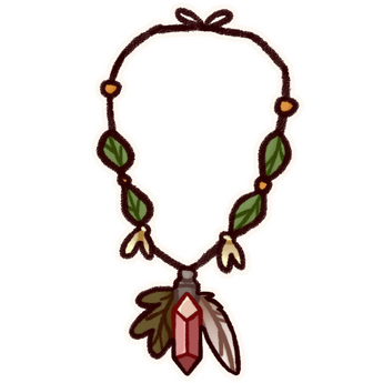
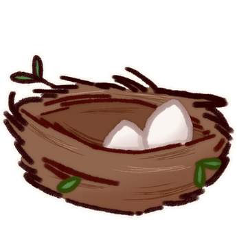
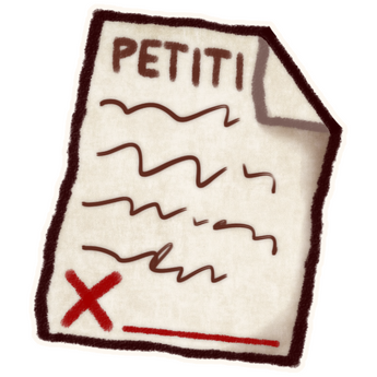
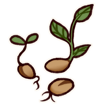
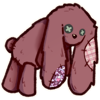
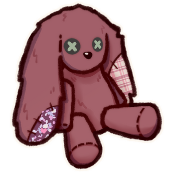
sculpting the future was a project where our team worked with Impact Makers to reimagine the questionnaire on the CreaTures Framework website, and was another time i specifically worked on a game's UI and item assets.our game was set in a small town, where the town square statue was recently destroyed. the town looked empty without it, so it was up to the player to sculpt a new statue that represented the town and its inhabitants using the items they received from the NPCs and picked up around town.
process:
the sculpting minigame UI and the illustrations for those items were my tasks.
we ended up using a font that i made of my own handwriting, as that fit the game's vibe more than a default font.it was very funny and a little jarring to see the in-game text "handwritten" by me, but it did look more cohesive and personal.something that ended up being very useful was me providing a layered .psd file with all the UI parts separate, so the developer could move and resize things in-engine without me having to send a new version every time.
we ended up going with a very warm color palette for the entire game, which we got by applying a filter on top of the original colors associated with the dimensions.for the characters, the artists on the team all made a design for the learning and co-creating dimensions to see what elements and whose style we thought would fit the game best.we kept the items "vague" on purpose so that one item could reflect multiple dimensions, and so even if an item was connected to a certain NPC, the player would not feel forced to include it.
the items: (variations can be found in-game!)

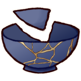
bowl mended using kintsugi and its shard

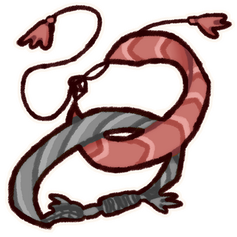
matching friendship bracelets given to the player by one of the kid NPCs! :D

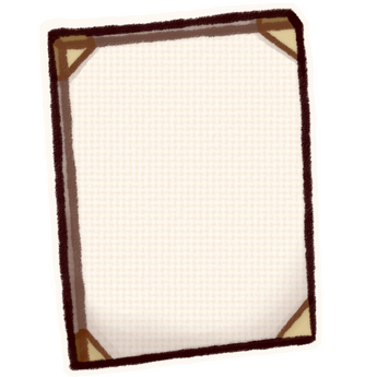
empty canvas

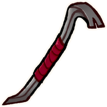
crowbar

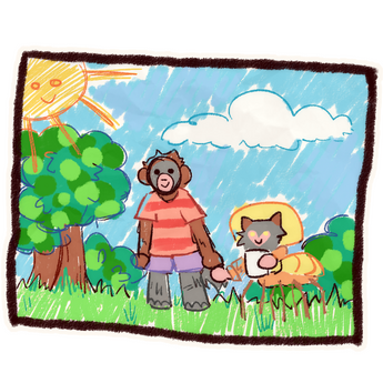
drawing by one of the kids of them and their friend hanging out!

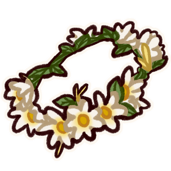
flower crown

kaleidoscope

magnifying glass

megaphone

an ornate mirror. say hi to yourself!

handmade (paw-made?) necklace

a bird made a nest on your statue!

empty can of pesticide

petition

budding seeds

a kid NPC's plushie! (ver. 1)

plushie v.2, after we got feedback that it looked sad

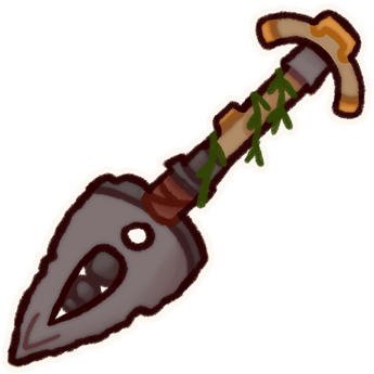
mysterious tool

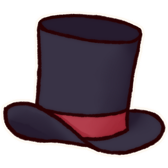
top hat

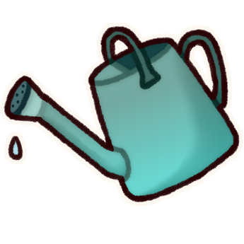
watering can
